Font Pairing Guide: 5 Quick Examples of Pairing Script and Standard Fonts
We wanted to offer up some answers for commonly asked questions we get about font pairing into a new series of font pairing guides. Our first tip? Pair script and standard fonts.
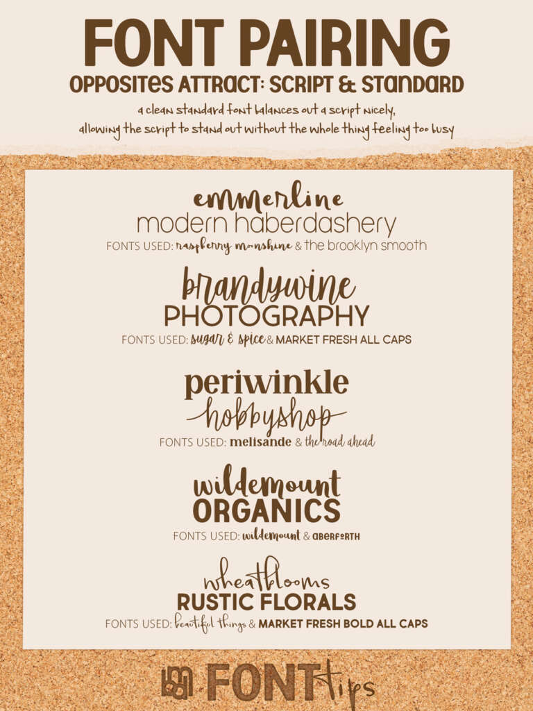
Script and Standard
Scripts are great! But they do tend to be ‘busy’. Try pairing one with another ‘busy’ font and they can battle with each other for attention, creating confusion and detracting from readability.
Simple standard fonts are also great! However, used by themselves in roles that should garner attention may make your project appear too formal or lacking in personality.
So an easy-to-remember tip: pair script and standard fonts together! Mixing these two together can help create a balanced look, keeping your work from feeling overcrowded, and making your title be the attention grabber. In fact, we often, in logo design, try to match the personality of the company/individual in a script font and use a standard font that conveys the level of professionalism of the industry they are in.
Please let us know what you think and what other future guides you would be interested in. 😀
Fonts Used in this Font Pairing Guide.
1. Raspberry Moonshine and The Brooklyn Smooth
2. Sugar and Spice & Market Fresh All Caps
3. Melisande and The Road Ahead
4. Wildemount and Aberforth
5. Beautiful Things and Market Fresh Bold
Check out other font Pairing Guides on our website here and on Pinterest.